Size-Minimal Fonts
Abstract: Notes on and thoughts about size-minimal fonts or character sets.
Topics: typography
© Copyright Daniel Krajzewicz, 11.04.2017 12:11, cc by
Introduction
Given a limited amount of pixel-space, size-minimal fonts — or character sets — become an interesting topic. In the following, some thoughts about them are given.
Capital Chars
How could a size-minimal font look like? When looking at upper case characters only — and only plain Latin characters — the vertical size is mainly determined by the maximum of horizontal bars, which is three (like in ‘B’). There is only one upper-case character that usually has a descender (lies partially below the baseline), which is the upper case ‘J’. Sometimes, this is also the case for ‘G’ and/or ‘Q’. We disregard the descender at first. Consequently, we have three horizontal bars, and given the fact that they must be separated, the minimum height is five.
Characters have different widths. ‘M’ and ‘W’ have a larger width while an ‘I’ is usually thin. But disregarding ‘M’ and ‘W’, all other characters can be drawn using a width of three pixels as some have left and right vertical bars, and a dividing white space.
A Basic Size-Minimal Font
Figure 1 shows a basic size-minimal charset with 3×5 pixels per character, with additional two pixels for both, ‘M’ and ‘W’.

Figure 1: Basic size-minimal char.
Some notes:
- B: We have to cut the corners for making the ‘B’ appear round on the right side.
- D: We have to cut the corners for make a ‘D’ look different than an O.
- I: An ‘I’ may have serifs or not (see also below). It would be the only character with serifs, yet it would be better distinguished from a lower case ‘l’ and its width would match the one of the other characters.
- K: We have to cut the middle of the right side to make a ‘K’ look different than an H.
- M: As mentioned, an ‘M’'s width is bigger than three pixels.
- N: ‘N’ is complicated, because the diagonal part can be resembled hardly using only one pixel. A solution with a width of four pixels, is visually much more appealing, see below.
- Q: ‘Q’ is complicated, because the bottom diagonal stroke usually reaches into the interior but there is no place for it. Disregarding this, at least a descender of one line would be nice. The five-pixel solution has to shift the bottom one pixel higher. One can recognize it as a ‘Q’, but it does not look well.
- W: As mentioned, a ‘W’'s width is bigger than three pixels.
- X: We have to cut the middle on both sides to make an ‘X’ look different than an ‘H’.
Variations
In the following, variations of some characters are given.
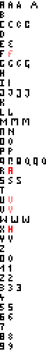
Figure 2: Upper-case character variations.
Combinations
From the given variations, one could build a “round” and a “rectangular” charset.
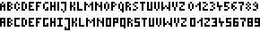
Figure 3: Upper-case “round” (top) and “rectangular” (bottom) character sets.
Lower-case Characters
Lower case characters have three horizontal lines as well, like in ‘e’. Additionally, some have both, a descender and an ascender like in ‘f’. The ascender may have only one line in height. This is not possible for the descender, because an extra horizontal bar is needed as the case for a ‘g’. Consequently, a lower case character set could be drawn with a height of eight pixels. The constraints for the width are similar to the ones of the upper-case charset. Only the ‘n’ can be represented in three rows instead of the four needed for an upper case ‘N’.

Figure 4: Basic size-minimal lower-case charset.
Some notes:
- a: There is a different version of writing a lower case ‘a’. Still, it is not possible to realise it in a width of three pixels. You may find it below in the variations.
- g: The descender could make a whole loop. Yet, this stretches the descender's height by two further pixels and the loop is not necessary for recognizing the character as a ‘g’.
- y: Same as for a ‘g’, one could use a whole loop.
Variations
Again, variations of some characters are given. Two ascender lines are used for aesthetic reasons.
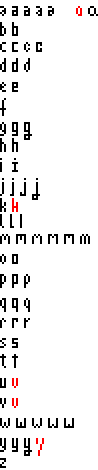
Figure 5: Lower-case character variations.
Combinations
Again, the “round” and the “rectangular” combinations are given in the following image.
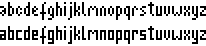
Figure 6: Lower-case “round” (top) and “rectangular” (bottom) character sets.
Full Characters
When combining lower- and upper-case characters, we need to stretch the capital letters to be as high as the lower-case characters including their ascender. Too many letters would be ambiguous if not done so. The resulting height is nine pixels and the width varies between one and five pixels.
The next figure shows some combinations.

Figure 7: Full “round” (top) and “rectangular” (bottom) character sets.
Closing Thoughts
Well, this entry presented some thoughts about size-minimal fonts. The resulting ones have characters that have a height of nine pixels what could be reduced to eight pixels by shrinking the ascender and a width of one to five pixels.
It looks trivial, yep, and it probably is. Still, it's the base for some extensions which I hope to present later.
One may note that the fonts used herein use only two colours — black and white. One could assume that even smaller charsets could be generated when using different shades of grey, imitating antialiasing.
References
- Wikipedia article about Typography: Explains the history and basic concepts of typography.
- Wikipedia article about Typeface: Explains the meaning of “descender” or “ascender”.